
 |
| Monochromatic For this one i used variations of a green colour. I feel that the colours to highlight the different objects make it look really bright and 'in your face'. i have used a dark green for text to make it stand out from the waves which are a mint colour. The turquoise used on the whale is very bright and this draws your attention to the centre of the page. |
 |
| Analogus For analogus i have used the three most saturated colours next to each other in the colour wheel. This is pink, blue and purple. The pink used on this is extremely saturated and this makes the whole of the colour look very messy and childish. |
 |
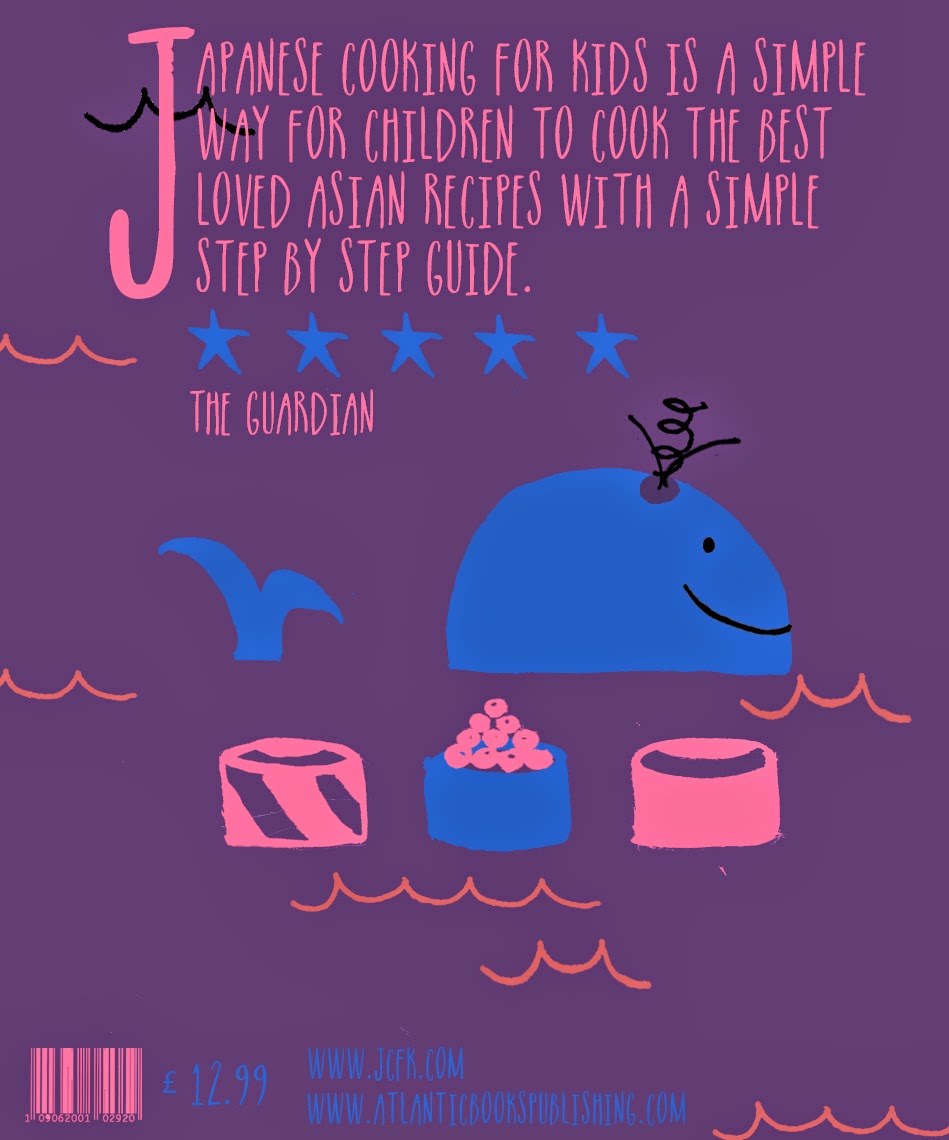
| Complementary The complementary colour scheme is my favourite so far and also has a very traditional asian feel, which is what I'm going for, the salmon pink stands out well from the blue background and the blue background also looks like the sea, which fits with the theme of my cookbook. |
 |
| I used the colour wheel decide which colours to use for analogous and complementary. |
 |
| For the monochromatic colour schemes i used only the colours in this square, including black,white and grey. |
No comments:
Post a Comment